The Business of Design
Design as an industry is unique in that people outside of the industry think they can “design”. Designers, in house and agency side, all struggle to find their unique differentiator to validate their discipline and add value. Here are a few lessons I have learned in my years as a design professional, solving design problems for a wide variety of clients.
Learn the business.
Some internal designers tend to be more focused on what they do rather than who they are doing it for. I always stress to my internal teams that the key differentiator for them being in house is knowledge. And, I’ve always been surprised how many had little desire or interest to really understand the companies and products they worked for. Internal design teams have a leg up on external agencies. We have deep knowledge and insights into customers that should give us an unfair advantage. The more the business sees that design is really connected to the company and the customers, the more they just might let you try some of your crazy ideas.
Remove Subjectivity
Design can be validated. Design can be tested. There are principles that as designers we must learn, adhere to and evangelize.
As design professionals, we need to be able to have conversations about ROI. Real impact of design changes. Design can move the needle.
Design for design sake has no place in business. Design for solving real problems does. Speak about design in a language that the business will understand. Show them how a “thinking like a designer” approach can help get to better solutions to business problems quickly.
Solve Real problems
Only when we are solving real needs do we truly add value. It isn’t enough to find a proxy for the customer. Especially today. The market is crowded in whatever field you are in. The consumer is educated. They’ve been exposed to more and more custom-tailored solutions. Only by going deep. Mining deep insights from real customer can we begin to understand real problems. Real problems = real opportunity. We used to talk in terms of “felt need” let’s return to that.
Apple, we need to talk
Let me just start out by saying, it isn't me. It's you. I admit it. I have been a fan boy. I'd have bought an Apple can opener if they had made one. But Apple has underwhelmed me as of late and if I wasn't tied to the ecosystem I would be looking at alternatives.

Let me just start out by saying, it isn't me. It's you. I admit it. I have been a fan boy. I'd have bought an Apple can opener if they had made one. But Apple has underwhelmed me as of late and if I wasn't tied to the ecosystem I would be looking at alternatives.
The following are a few reasons why I'm falling out of love with Apple and may be on the market for another love interest

Reason number 1, The Apple Watch
I tried. I really did. But after 3 weeks of looking for a reason to keep this thing strapped to my wrist, I gave up. To be fair, I don't wear a watch. The last one I wore was a Swiss Army Watch. Loved it. There has been plenty written about all that is wrong with the Apple Watch, so I won't belabor the point, but here are my top 3 issues in no particular order:
1. Where is the killer app? Is it Apple Pay? Activities? Messages on your wrist? I did find Messages on my wrist while riding my motorcycle helpful, but so is SIRI connected to my Bluetooth helmet. Nothing so far is a "must have" that I can't do without.
2. The battery is crap. If you try to take it anywhere there isn't power, say camping, it's dead in one day. I at least expect a watch to tell time for a month without winding it. Or charging it.
3. Its dependency on the iPhone. Take it 30 feet away from your iPhone and you have a $500 fit bit and Mickey Mouse watch. I still find reaching in my wallet and pulling out my credit card just as fast as Apple Pay.
4. The UI. No matter how I tried (and I do this for a living) I couldn't get the hang of the interface. It's pretty convoluted. maybe I just need to give it more time and read the damn manual, but I expect Apple products to be more intuitive. I don't see 3 year olds learning this as easy as the iPad.

Reason number 2, this thing
I know I'm being petty. But "different" doesn't mean "better." I liked the old iTunes UI. Especially on my phone. They changed up so many elements it took a week or so to try to find my way back to my most used screens. Try changing albums when you're on your motorcycle. Wait. Scratch that. Let's just leave it that the first tenants of good UI design are "do no harm." My take on the new UI is that its purpose is to shill the new Apple Radio and Apple Music. Not enhance the user's experience. Just my opinion.

The Apple Wii
Reason number 3, lack of "category redefined"
Apple had a great opportunity that they missed with TV. They redefined the market for music and for phones. TV could use a great disruptor, but as of last week, it isn't Apple. The new Apple TV is sort of, uh, like a Wii. Yep. It's a "me too" move by Apple to play In the gaming world. Which according to the reviews, it does mediocrely. Where is the actual "Apple TV?" You know, a large screen, retina display, with its own ecosystem of content designed to be the "cable killer?" Sure. You can subscribe to MLB, HBO Go, HULU etc, but Apple had an opportunity to stand TV on its head. This isn't it.

Image from Wired.com
Reason number, oh whatever...
This is their biggest innovation for 2015? I keep thinking... WWSS. What would Steve Say? Steve Jobs said Apple didn't need a stylus because you have a finger. Or something along those lines. I'm sure it's great. I'm sure it does what no Stylus before it could do. Is it a game changer? Is it redefining the market? Maybe my expectations are too high. But with Steve, you knew you were getting "magic."

Purple is the new Black?
This has nothing to do with the products, but apparently Purple is the new Black at Apple. Just not a fan of Purple.
So yeah. I'm losing my love for Apple. Will I leave them? Not yet. It's too hard to separate all of my "stuff" and bring it over to another platform. They have me for a while longer. Most of their UI is still better than anything out there. But it seems to me the magic left with Steve. It happened before. When he left the first time. But unfortunately, he won't be coming back to save Apple a second time.
Build vs Buy
In house vs agency. Full time employees vs contractors. Internal creative vs external. The devil you know vs... Well, you get the idea. If you are in the business of running an internal creative organization, you have either wrestled with the arguments for and against internal vs external creative...

In house vs agency. Full time employees vs contractors. Internal creative vs external. The devil you know vs... Well, you get the idea. If you are in the business of running an internal creative organization, you have either wrestled with the arguments for and against internal vs external creative. When to. When not to. How to staff for the peak times. How to retain good creative etc...
The following isn't a "10 things to know about" or other type of click bait listing, it is simply observations from someone that has solved these problems in different settings, got various organizations, with varying business needs.
When should you build?
Deciding to build an in house creative organization is a big step. You've come to this decision either because of the rising costs of agency fees, or you are tired of training the latest creative director to understand your business. In house makes sense if you have the following:
Are you trying to tell time, or build a clock?
Clock making takes extraordinary talent. It's a specialized skill. If you are trying to build a clock (have a long term strategy), having creative close at hand and invested in the long term outcome of your company's strategy is your best bet. Apple and Google both have internal design at the core of their company.
If you are simply trying to tell time, Design as a means to an end, an agency relationship may be your best choice. While design can become the competitive advantage you need, it isn't always strategically integrated into your core.
High quantity, fast turn production work.
This would be any work that is template driven, and the turn times are so fast (days, not weeks) that external communication with an agency wouldn't be fast enough. In the right environment, this could be outsourced, but I have found the work flows much more efficiently in house.
Fixed costs verses discretionary
Sometimes budgetary and financial strategy takes precedent. Do you have the budgetary flexibility to have fixed assets on the books, or do you need to keep headcount reduced and have more discretionary discretion?
What is a Brand?
I am often surprised by the answer to this question when answered by brand "professionals." Maybe I'm being a little unfair as the topic of brand can cover everything from metrics to voice and personality. And all of these elements, from visual artifacts to sound, contribute to the overall "brand" of a person place or thing.

I am often surprised by the answer to this question when answered by brand "professionals." Maybe I'm being a little unfair as the topic of brand can cover everything from metrics to voice and personality. And all of these elements, from visual artifacts to sound, contribute to the overall "brand" of a person place or thing.
So imagine my surprise when brand discussions initiated by Brand Agency's focus solely on colors, logos and imagery. Not that these aren't important, but they aren't the heart and soul of a 'brand."
Much has been written about the "10 this" and the "5 that" of branding. This isn't that. But to satisfy that part of your brain, here are the "5" metrics of a strong brand:
It must be relevant to a real or projected need in the marketplace.
It must be deliverable—the company must have the infrastructure, assets and intellectual capital to fulfill the promise and deliver value.
It must be credible—the company behind the promise must be perceived as capable of delivering it.
It must be differentiating—it must possess some quality that distinguishes it from all other competitively relevant brands.
It must be both inspired and inspiring—it must motivate interest, action and enthusiasm among employees, shareholders and customers.
Now I want to speak to that intangible. The Heart of the brand. So to prove my point, let me tell a few stories. The names weren't changed because the lesson is important.

I was attending a branding conference in New York with the Conference Board. A well respected agency presented the re brand of Delta Airlines. They defined the problem statement as Delta had a perception in the industry as a staid, old fashioned, down south airline. Some of the contributing factors were elderly flight attendants, their southern roots, ancient policies of "how we do things."
I think they were very effective defining the problem as a personality issue, and perception of that personality. So I was surprised when during the "solution" presentation, it was all about the visuals. That to me is akin to saying the way to change a persons personality, is to change their clothes. You can make them look different, but how are you going to make them act different?
I asked this question, only to be met with uncomfortable silence. They still had the same employees. The same (in their words) 70 year old flight attendants. The same heart of the company that acted the way they have for however many years, but now they had a shiny new set of clothes.
Fast forward to last month. I am sitting in multiple pitch meetings with DRTV agencies for a new spot for one of the brands we manage. As I see concept after concept presented, one question emerges from my lips. And one question only. "How are you going to inject the brand into this spot?" I was a little surprised when one agency responded "with colors and the logo." With colors and a logo. If only it were that easy to create a brand.
For those of you who desire simple, how tos in life, here is my one step, simple brand test. It's called the Badge Test. It's not original, I didn't invent it, but it works. Here's how it works. Look at the ad, brochure, TV spot, website, etc... of the company you are trying to brand. Cover up the logo and ask yourself this one question "Could this creative work for any company, or is it unique to THIS company?" That's it. Simple. All of the personality of the brand should still show through. If you could swap out the logo and the creative could work for a competitor, then the brand hasn't been captured. Esoteric, yes. Elusive, sometimes. But when you capture and communicate what is truly at the heart of a brand, you make magic.

BASF: How to almost get it right.

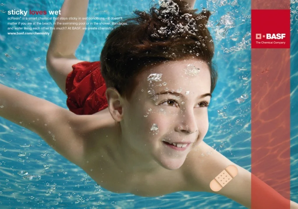
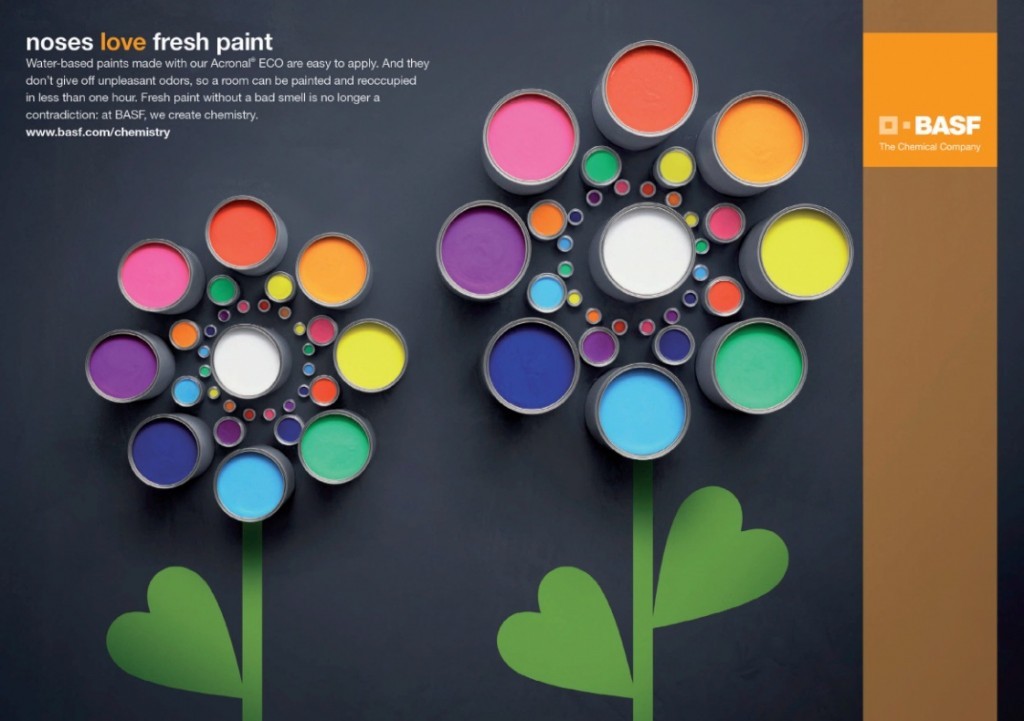
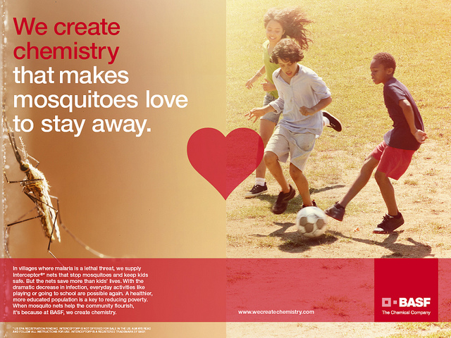

Skin that Loves the Sun. Sticky Loves Wet. Noses that Love Paint. BASF has created a masterful ad campaign that demonstrates the true value of the company. Building Chemistry. Chemistry. Not the science of matter, but the science of interactions. Lovers have chemistry. People have chemistry. BASF has finally made you care about what they do, even if you don't understand the what.
BASF has a brand challenge in that they don't make end products, but supply the chemical innovations to allow manufacturers to make better products. Whew. Try marketing that. So, when they rolled out the new branding campaign you see here, and recently started airing on TV, I thought, "they finally got it right." Well. Close. The ads are brilliant. They create a type of chemistry. Chemistry in the sense of a positive interaction between two traditional enemies. Paint and noses. Skin and sun. BASF and the general public. But, where I think (and I may be the only one) they fall down is in their tag line. The headlines read "We create chemistry" which is a strong position. But the tagline "The Chemical Company" takes them away from the aspirational, to the mundane. Ho Hum. A Chemical company.
Close. Very Close.
The Secret to Happiness
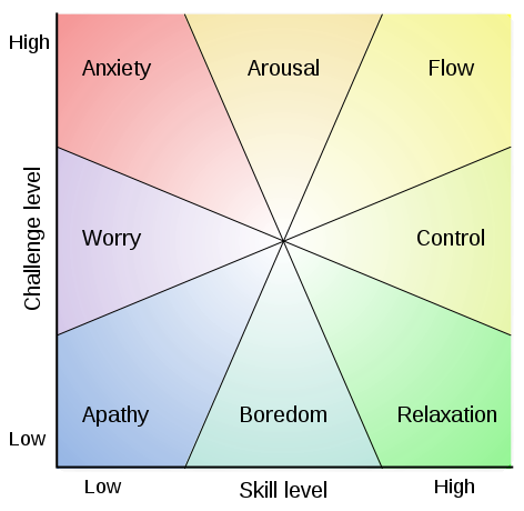
Flow, also known as Zone, is the mental state of operation in which a person performing an activity is fully immersed in a feeling of energized focus, full involvement, and enjoyment in the process of the activity. In essence, flow is characterized by complete absorption in what one does. Proposed by Mihály Csíkszentmihályi, this positive psychology concept has been widely referenced across a variety of fields.
Flow, also known as Zone, is the mental state of operation in which a person performing an activity is fully immersed in a feeling of energized focus, full involvement, and enjoyment in the process of the activity. In essence, flow is characterized by complete absorption in what one does. Proposed by Mihály Csíkszentmihályi, this positive psychology concept has been widely referenced across a variety of fields.
Ok. That’s the official Wikipedia definition. But what does that mean? Let’s look at it this way. Do you remember a time when you were working on something so engaging that time seemed to disappear? The next thing you know, the sky is dark, you’ve missed dinner, the wife and kids (or whoever fits this category) think you may have died because you’ve been so quiet? Yes. That feeling. That’s FLOW.
Optimal experience. Hyper focus. Spontaneous joy. So many phrases. All trying to capture the essence of Flow. Some call Flow the secret to happiness. That is, if you can find that place where things just “Flow” (I know, using the word too much. Bear with me a minute, we’ll get there) find the place where your mind is engrossed, challenged, fulfilled, we will indeed find a state of happiness (not permanent mind you, that’s more than I can promise.)
To break it down even further, Flow can be summed up as a perfect balance of two components; The old and familiar paired with the new and challenging. I know I am over simplifying what is a very complex idea. But at the core, it really is quite simple. If your life has too much of the old and familiar, you become bored and complacent. Too much new and challenging and chaos reigns. Ideally, Flow is the perfect balance, for you, of just enough familiar and comfortable to give you confidence, mixed with enough new and challenging to cause you to grow. Find this perfect balance, and there you have it. Happiness. For a while at least.
What does this have to do with design and UX you ask? Everything. As we create new experiences for users, we need to take the concept of Flow into consideration. Have we made the UI too predictable? Are we asking the user to learn a new visual paradigm? If we are creating experiences that are meant to engage and retain an individual, then we need to find that balance of familiar and new, comfortable and challenging. Enough to keep the engagement level high, and get the Flow, flowing.
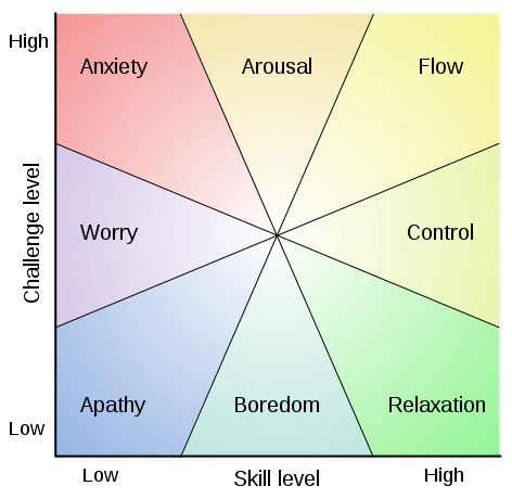
The secret to Flow. Balance challenge with existing skill.
The Only Constant is Change
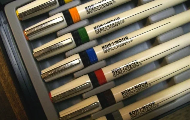
I remember when I started design school in Germany. No fancy computers. Heck, we couldn't even use Rapidiograph pens. We had to mix our own Gauche paint and use flow pens to draw lines.Line after line.
To say I've been in this industry a long time would be an understatement. No, I'm not old. I just started really, really young.
I remember when I started design school in Germany. No fancy computers. Heck, we couldn't even use Rapidiograph pens. We had to mix our own Gauche paint and use flow pens to draw lines.Line after line. Blop after blop of gauche (if you didn't do it right.) And for letters, we couldn't use Letraset. We had to hand draw each letter... those days are gone. But I can't say we are any better off because they are.

Letraset in it's prime. Position, rub, letters!
After the era of "hand doing everything" came the desktop publishing craze. Buy an Apple Classic computer, get a copy of Adobe PageMaker and viola! You are a "desktop publisher." Now you need to take your creation to an output bureau for Linotype or film. Well, it didn't take long for designers to realize that desktop publishing wasn't going to replace them, but it did put an end to the old way of design and now the designer had to do it all. Typesetting. Color correcting. Separations. Output. Everything.
Enter the WWW. As a designer, your world was going to take a drastic turn. Mosaic. Tables. HTML. DeBabalizer. Single Pixel GIF trick. David Siegel. BBEdit. Design and conception took a back seat to code and browser compatibility. But we learned. We adapted. And it seems the print industry didn't suffer or disappear. (The end of Print wasn't.)

NCSA Mosaic. The internet in all of it's glory. Circa 1993.
The Dot Com boom in the late 90's and early 2000's gave rise to a whole new breed of job title. Web Developer. Web Designer. Web Architect. etc... and everyone rushed to put "Web" in their title. True story. At my last place of employment, I couldn't get approval to hire a copywriter. Until I put "web" in front of the word "copywriter." Whatever. It worked.

The pets.com sock puppet was one of the biggest selling items of the now defunct company. The internet gave rise to a whole new industry of jobs and technology, but no one wanted to buy dog food online.
Fast forward to 2014. UX is the new cool. Everyone is rushing to be a UX something or other. UX Designer. UX Architect. UX Fillintheblank. I guess it was inevitable. With companies like Apple and BMW proving that design matters, building great experiences is more important than cutting edge technology. User Experience is now a key differentiator. What good is the new new if you can't USE it?
So what is next? What comes after UX? In "The Designful Company Design," Marty Neumeier posits that design is rapidly spreading from “posters and toasters” to processes, systems, and organizations. Design will not only take over how we think about customers, but how we plan and run our internal organizations. How we structure our business. As Marty says, "if you want to innovate, you have to design."

Elephants and Rhinos
n 1999, I started a job with Olive Design as the Design Director. Olive had a unique situation as the staff was mostly young, fresh out of college raw talent, that didn't quite have the experience of running an agency. Kyla Kanz, the owner at the time, likened her situation to a story out of Johannesburg describing the mysterious killing of Rhinos in a wildlife game preserve (bear with me for a few minutes.)
In 1999, I started a job with Olive Design as the Design Director. Olive had a unique situation as the staff was mostly young, fresh out of college raw talent, that didn't quite have the experience of running an agency. Kyla Kanz, the owner at the time, likened her situation to a story out of Johannesburg describing the mysterious killing of Rhinos in a wildlife game preserve (bear with me for a few minutes.) It seems that the culprits were young bull Elephants that had been placed in the preserve without adult supervision. There weren't any older, wiser bull elephants to show them the way, and help them get along with their Rhino neighbors. The simple solution was to introduce a few older bull elephants into the preserve and the killing stopped. My point? Without the benefit of age and wisdom, youthful energy can be mis-focused and even potentially harmful.
When I stepped into the creative director position at National Instruments, I found a situation not unlike the Johannesburg game preserve. No, clients weren't being killed, but the team was full of young, inexperienced raw talent with no experience to guide them. They were frustrated that the clients didn't take them seriously. The clients were frustrated that the team didn't listen to them. With no one to guide them, they sheltered in place and adopted a siege mentality.
As leaders of creative organizations, we constantly strive to create the perfect balance of youth, energy, creativity and experience. If you hire too many young creatives with great portfolios, you get new ideas without the ability to sell or nuance the customer experience. Too many grey hairs in your team? Great experience, but are they tapped into the new, the fresh, the innovative?
Balancing a blend of the two is tough. The older generation doesn't understand the work ethic, or perceived lack of one, of the younger generation. The younger generation doesn't always see the benefit of the wisdom and experience of the older. And so it goes. But the best work, the best teams, successfully combine the two, balancing the strengths of each for an unbeatable combination.
In the teams I build, I try to maintain a balance of experience and energy. I find that the younger designers aren't afraid of experimentation. They are willing to push ideas to the extreme, and will often do the unexpected. This can be challenging for the experienced designers, threatening even. But knowing how to channel that energy into a winning concept requires the skill and business acumen of a creative veteran. Both have important roles to play. Both are essential for propelling a creative organization forward. Lean too far in one direction or another, and you may have to explain what is happening to all of the rhinos...
Skeuomorphism
It's just a fun word to say. For those who haven't read the countless articles trashing Apple's design department, skeuomorphism is a physical ornament or design on an object made to resemble another material or technique.
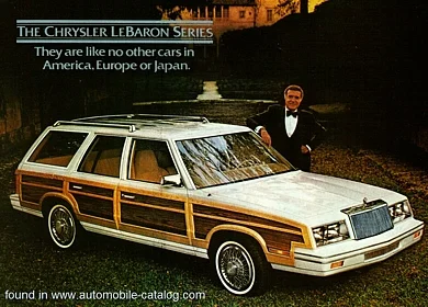
It's just a fun word to say. For those who haven't read the countless articles trashing Apple's design department, skeuomorphism is a physical ornament or design on an object made to resemble another material or technique. Think about the trash can that lives in the Mac OS dock. Think about the wood paneling on the 1986 Chysler LeBaron station wagon. Skeuomorphism has been around since the 1890s.
We needed Skeuomorphism
When Apple created the very first GUI, (ok, they borrowed it from IBM, but that's another story) they needed a way to help users understand the interaction model. How do you make sense of a completely digital environment? You mimic elements from the real world. A paper icon for a digital document. File folders for holding those documents. A trash can for getting rid of those documents. etc...
My father was a control operator at a Dupont plant in California. He turned physical valves and read physical dials to control the plant. Once the controls went digital, it made sense to use digital skeuomorphs to give the operators instant familiarity with the interface.
Windows 8 and a much flatter world
Fast forward to the launch of Windows 8 and the end of all things skeuomorphic (sorry. I just love that word.) Microsoft flattened out our digital world based on a simple premise, that the average consumer was now so familiar with digital interfaces, we no longer had to have the visual cues that skeuomorphism provided. We could drop the fake wood and felt of IOS 6, and flatten our interfaces and make them more adaptable to responsive design. And this is where the debates live. Is flatter better? Is Skeomorphism evil?
Consider the end user
As with all design, the question shouldn't be about style, it should be about the end user. Is your target customer very familiar with digital interfaces and multi touch gestures? Then you can probably ditch the overly obvious designs and take advantage of the new interface styles constantly evolving. Is your target still new to the digital world (like my father) and needs a familiar interface to help them be successful? Then a form of skeuomorphism is probably right for you.
I know this may be over simplistic, but I have read too many articles arguing the merits of one over the other, and in most of them, the end user is not considered. While there are aspects of IOS 7 I like, I think Apple went too far in the other direction just to be different. I think they actually made some items harder to use because they abandoned imagery and interaction models they had successfully trained millions of customers on.
Leadership
I know a lot of people that think the secret path to career success (at least in large corporations) is to become a manager. In my career as a manager, I have talked many people out of "moving up the management ladder."
I know a lot of people that think the secret path to career success (at least in large corporations) is to become a manager. In my career as a manager, I have talked many people out of "moving up the management ladder." For some, management is an easy way to gain authority. They think with it comes respect. But directing people via chain of command is management. Not leadership.
It is much harder to get people to do what you want out of respect, and inspiration. That is what a leader does. A leader paints a vision so compelling that people who have no reason to do so, want to follow. People that may report to them, and people who may not.
Here are a few traits of a leader that I have gathered from other leaders in my last 10 years.
You might be a leader if you:
Celebrate the paradox (something could be right and wrong at the same time) and live and love it.
Are lonely and uncomfortable
Are willing to be wrong
Are a role model, constantly
Are hands on, micro knowledge vs micro management
Optimize by having way to much to do
Celebrate the half life of "bad ideas" (everyone thinks their ideas are great, and everyone else’s are bad. If you let people sit with your idea for a while, over time they will start to see your idea as their own, and it will suddenly become much better.)
Invent expectation (invent, not set.)
Are very self critical
Eliminate Bososity (Guy Kawasaki)
Obviously, this isn't exhaustive, and some of these may be controversial. But I know that being a leader is harder than being a manager, but I also think it is more rewarding in the end.